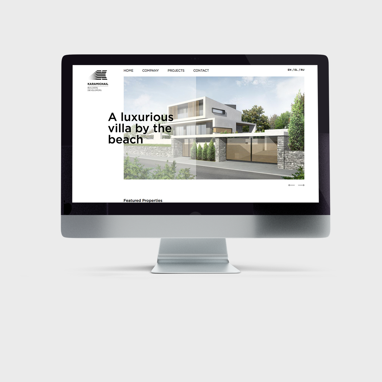
STAND PROUD, STAND TALL
Construction is a sector heavily hit by the recession. The companies that manage to overcome it are introducing themselves to the market, only this time with a more self-confident and solid profile. One these companies is Karamichail Builders – Developers, and one of their rebranding’s mandatories was the incorporation of this feeling.
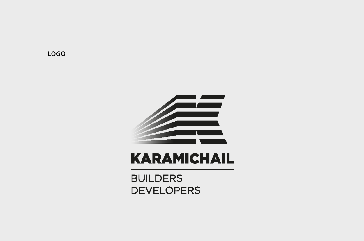
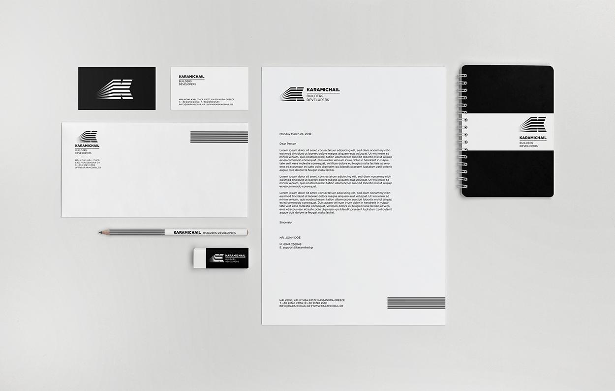
Capital K is the brand’s new symbol. Its horizontal layers represent a building’s floors -an element present on the layering of the typography as well- and the company’s growth over the years. The emphasis on black -as any other color is absent- gives to the logo a concrete feel, that goes beyond any trends of ephemeral design. As for the symbol’s perspective, it represents both the company history and its dynamic towards the future.