THE LETTER N
Everyone’s familiar with Netflix. However, something that some might know -or notice- is that today’s top media services provider has taken localization to a whole new level. One of its aspects is the redesign -when necessary- of its movies or series’ titles. Being part of an ongoing Wordbank project (as a freelancer) that began back in Sept 2017, it can be considered in terms of the overall experience a chance of a lifetime -to say the least.
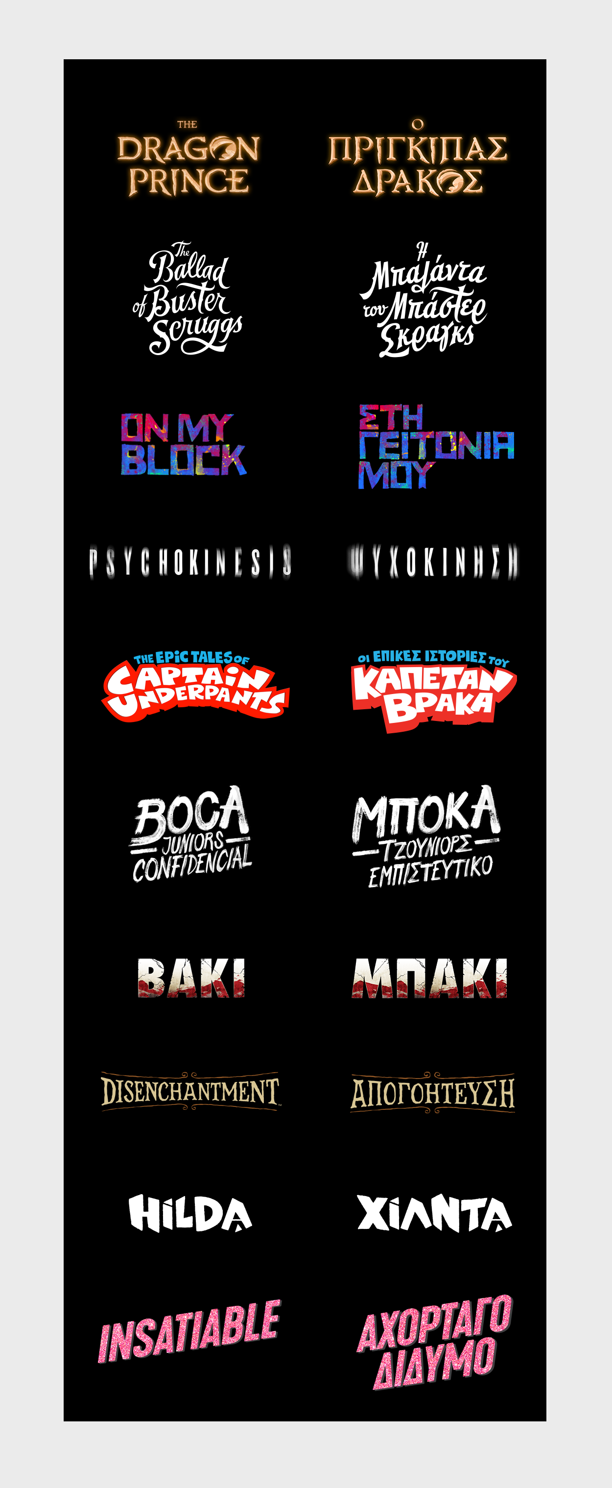
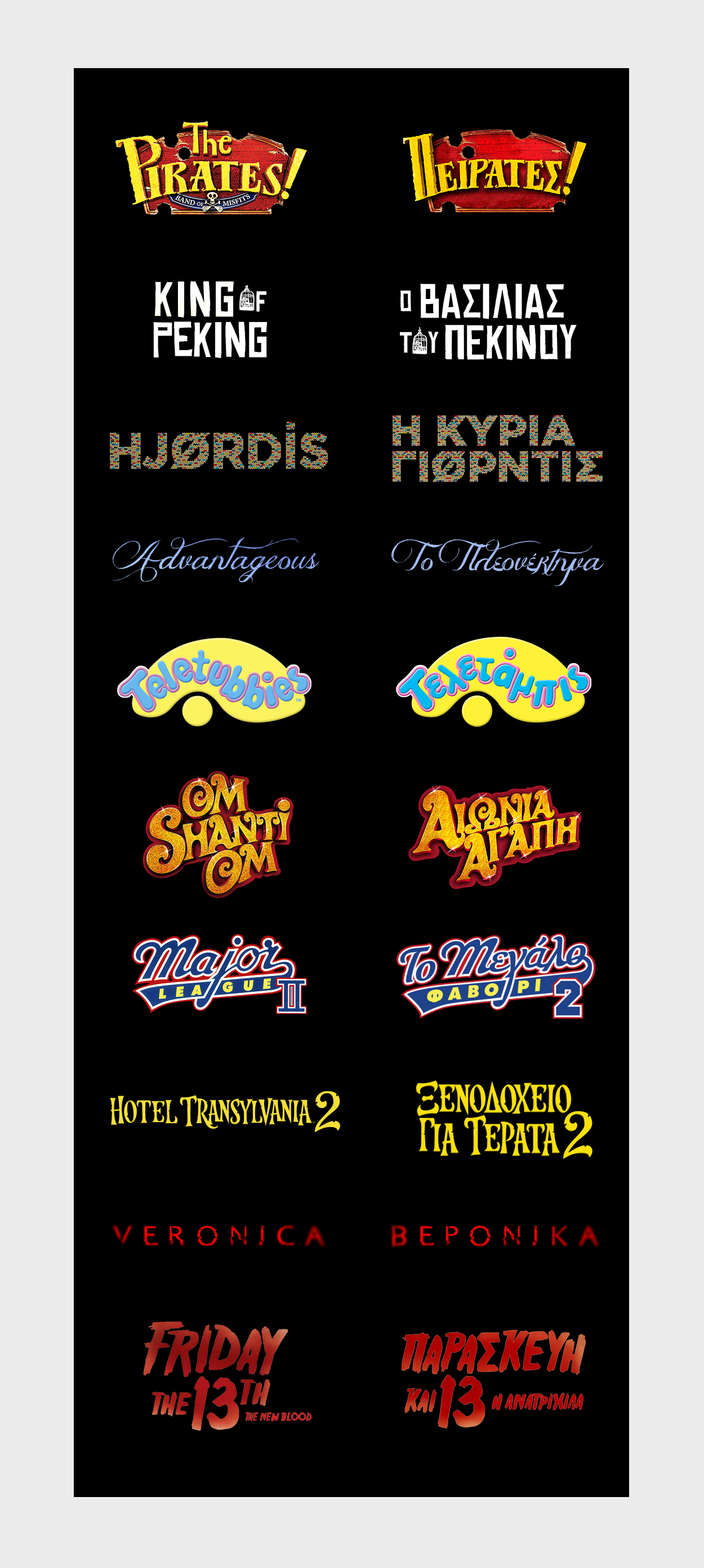
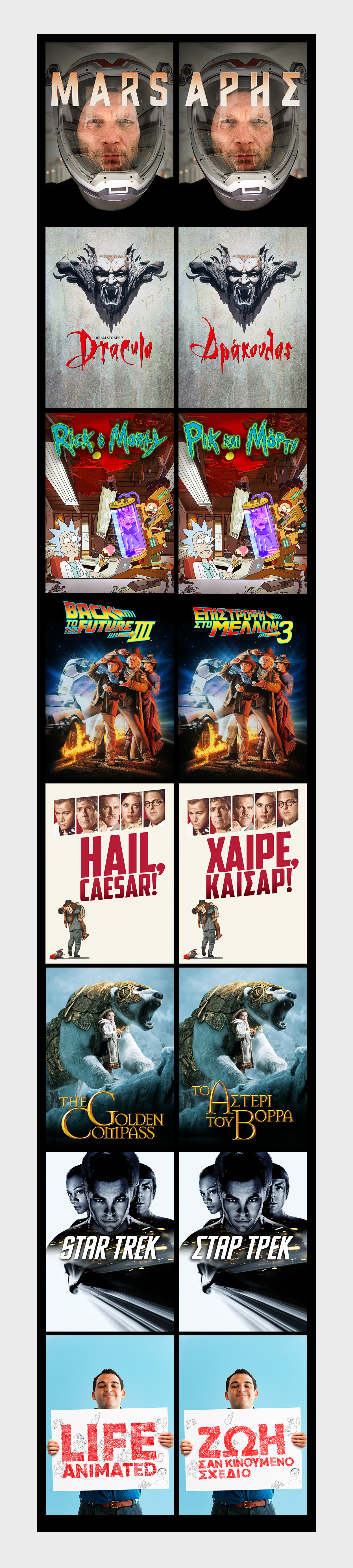
The project included the logo design for a large number of titles, for both Netflix Originals and licensed titles. Its requirements were simple, yet demanding: excellent typography design and particular skills, such as deep knowledge of the design of Greek typography. Being simply a Greek designer wasn’t enough. Therefore, it was an excellent opportunity for testing and mastering the Adobe Suite. The use of serifs, calligraphy or 3D styles -and of course, the proper adaptation of them- is a process that goes beyond a simple replace-characters-when-necessary norm, and reflects a genuine and thorough insight of a written language -and of course, its typography- with a significant and special character.