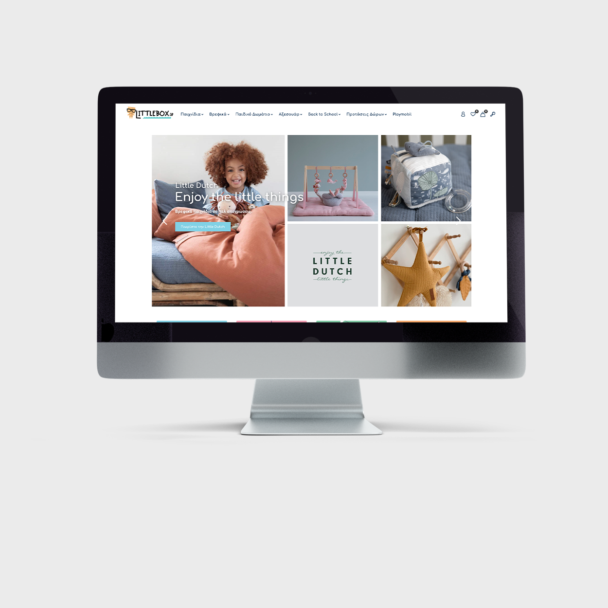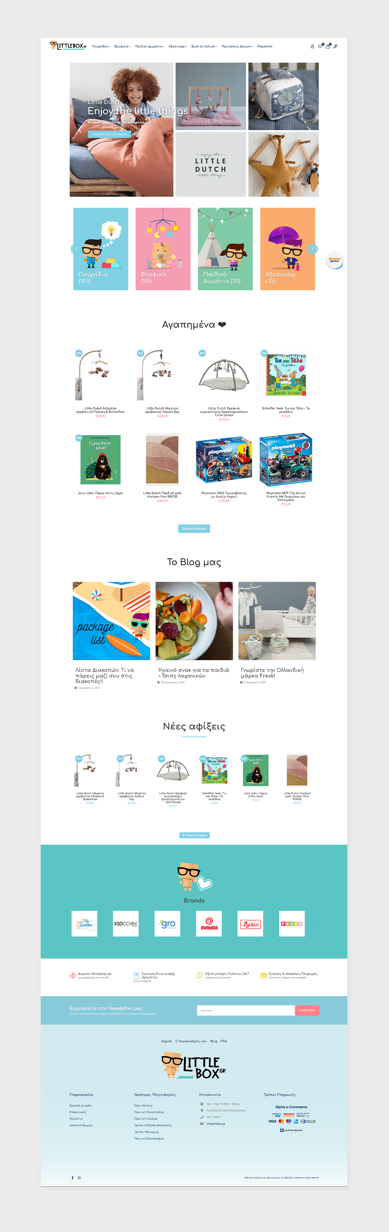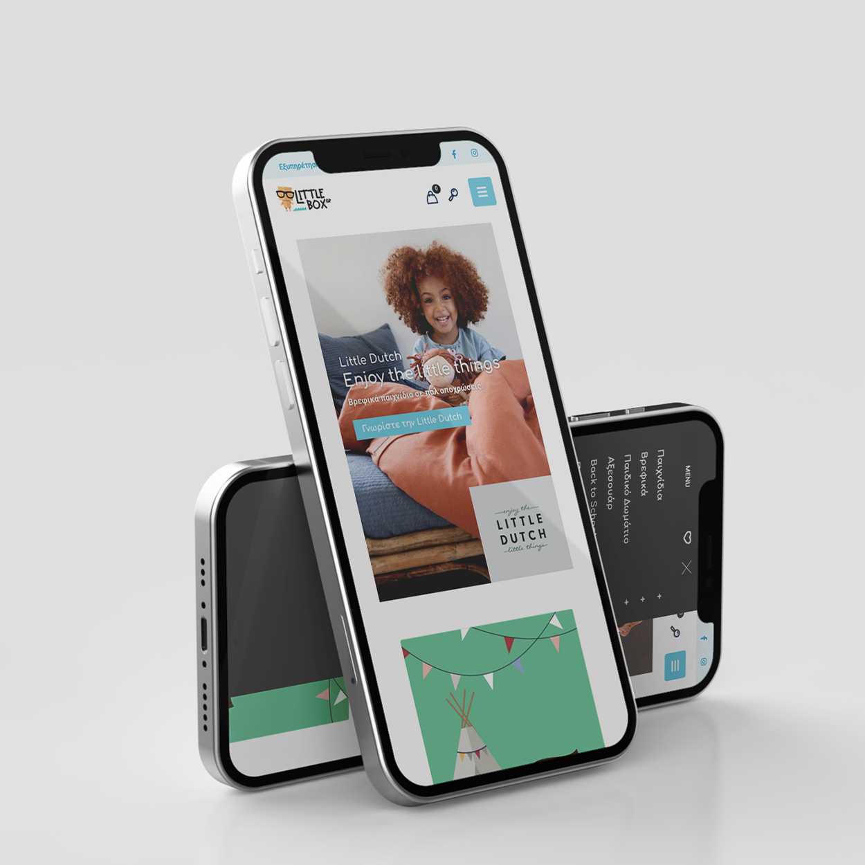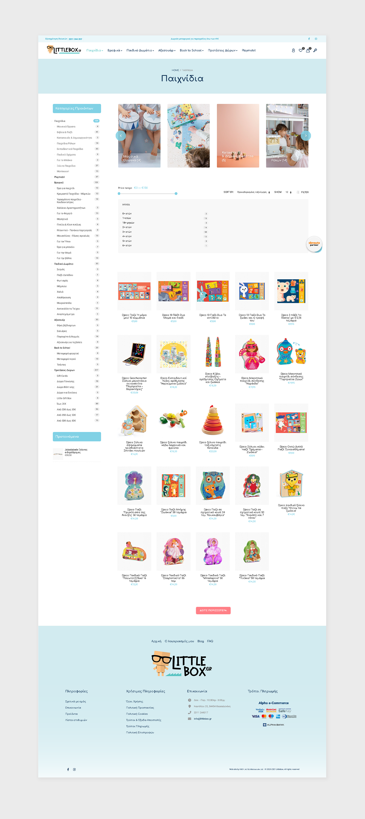
THINK OUTSIDE THE LITTLEBOX
Toys are children’s words and play is their language. As for Littlebox, it is an online dictionary full of finesse and imagination, where simplicity outranks any fancy gimmick. You see, Littlebox specializes in wooden and classic toys. And as such, the most appropriate visual identity for it would be the one which could incorporate its character.
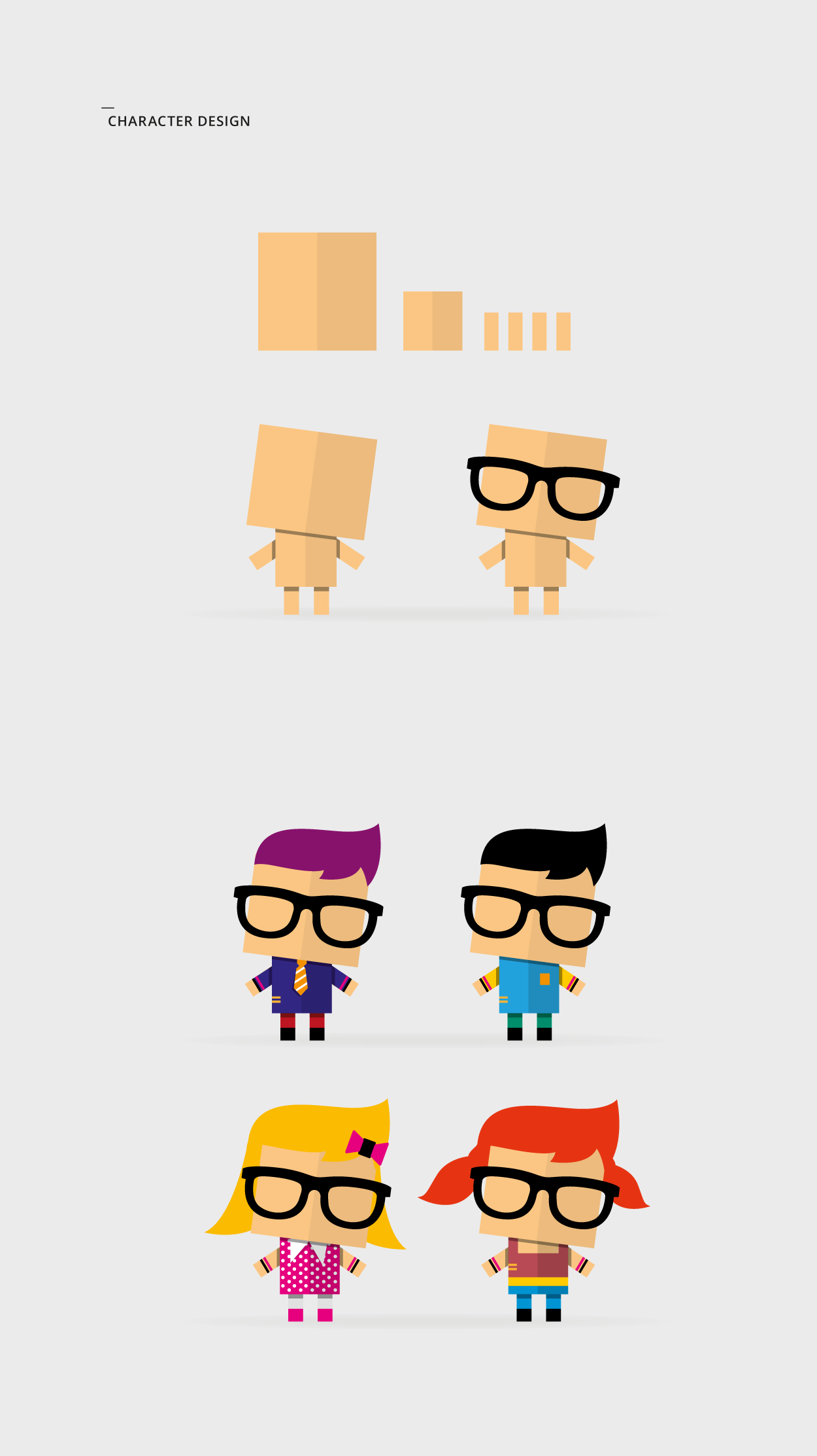
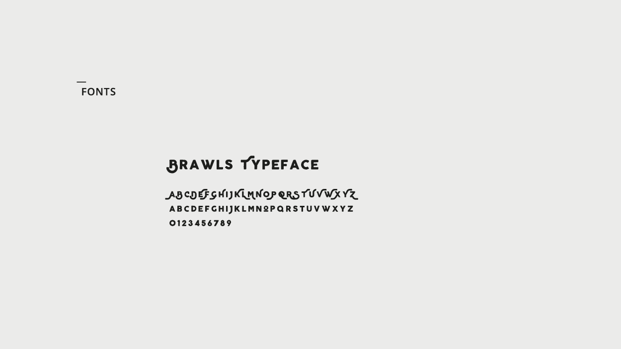
Speaking of which, a basic kid-like figure was the character that set the visual foundation of the project. A figure which could be easily transformed into a boy or a girl, with a basic set of simple, colorful characteristics and a geeky/retro touch (the glasses). From that point on, everything started to fall into place. The typography approach with its playful font, the overall sensation of their combination, created a brand identity that matched since day one Littlebox’s character.